
Table of contents
- Quick nav
Fix Text Overflow in Localized App Store Screenshots: A Measured Walkthrough
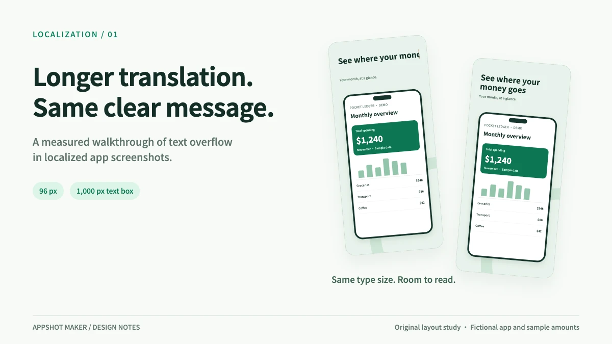
Your original caption fits on one line. The translation runs past the edge. Shrink the type and the words fit, but the headline becomes harder to read on a phone. A finished screenshot set can turn into another round of layout work as soon as you add a language.
Keep the source version, try a meaningful line break, and make room below the headline before reducing its size. This walkthrough uses a budgeting-app example to show the trade-offs, with measured widths you can check and a workflow you can apply to your own screenshots.
Produced by AppShot Maker and checked on November 21, 2026. Pocket Ledger is a fictional teaching app; the amounts are sample data. The images are original layout illustrations. The measurements describe text geometry, with no claim about downloads or conversion lift.
Identify the failure before changing the font size
| What you see | What to check | First adjustment |
|---|---|---|
| The last words disappear | A single line exceeds its text area | Add a phrase break or shorten the wording without losing the promise |
| The headline fits but overlaps the phone | Another line consumed the gap below it | Move the subtitle or device and reassess the composition |
| Some letters become boxes or look unusually wide | Font coverage and loading | Choose a font that covers the script, then check the fit again |
| The exported image wraps differently | Fonts and dimensions in the final output | Compare the downloaded file with the editor |
Translation changes more than character count. Glyph widths and word boundaries matter, especially with short captions and long compound words. A blanket expansion allowance cannot tell you whether a specific headline will fit. W3C's internationalization guidance recommends allowing text to reflow and considering differences between writing systems. W3C: Text size in translation
A controlled width check in three languages
The example promise is simple: understand your spending. The captions below are candidate ways to express that benefit. They are not word-for-word equivalents or a substitute for review by someone who understands the target language and the product.
We fixed the layout at 1206 × 2622 px, with a 1,000 px text area, Noto Sans SC Bold at weight 700, 96 px type, and zero letter spacing. That leaves 103 px on each side. This canvas is a reference for the experiment; your upload still needs to match the intended store device slot. Apple screenshot specifications
| Language | Candidate caption | Characters, including spaces | Single-line width | Fit in 1,000 px |
|---|---|---|---|---|
| Simplified Chinese | 看清每一笔支出 (Track each expense) | 7 | 672.0 px | 328.0 px to spare |
| English | See where your money goes | 25 | 1,316.2 px | 316.2 px over |
| German | Behalte deine Ausgaben im Blick | 31 | 1,531.4 px | 531.4 px over |
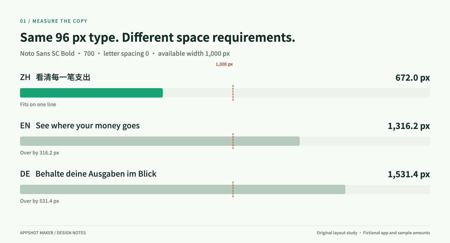
Figure 1. The Chinese measurement excludes the English gloss. Holding the font constant isolates the space each caption needs. Changing the font, weight or letter spacing calls for another check.
Measurements were taken in Chrome 157 after the font finished loading, using Canvas measureText(). Widths are rounded to one decimal place and describe horizontal advance width. They do not test line height, vertical clipping, every possible glyph, or the final exported image. This is a controlled typography experiment, rather than a benchmark of AppShot Maker's export engine. Download the measurement record
Three treatments of the same English caption
The wording stays constant in this comparison. Only the headline layout changes.
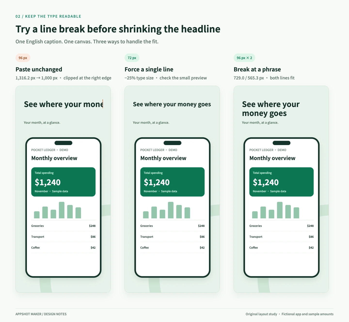
Figure 2. Original illustrations with the same fictional app UI. The left-hand version demonstrates clipping in a fixed text area; actual editors may wrap, clip or let text overflow.
Paste unchanged
A line measuring 1,316.2 px cannot fit inside 1,000 px. Look for missing words, overflow and unexpected wrapping. If the export clips the headline, correct the editable text layer and export again.
Reduce the type until it fits
Scaling by width gives a maximum size of approximately 96 × 1000 ÷ 1316.2 ≈ 72.9 px. We used a whole-number size of 72 px, a 25% reduction from the original.
That can be a valid design choice. Check it at a smaller display size before committing. When the 1206 px-wide image is displayed at 180 px wide, a 96 px headline has an effective size of about 14.3 px; a 72 px headline becomes about 10.7 px. The 180 px preview is a fixed check used here, not a universal store display width or a minimum-size rule.
Break at a phrase and keep the type size
The English caption can become:
See where your
money goes
At 96 px, the two lines measure about 729.0 px and 565.3 px. Both fit. The German candidate can be split as:
Behalte deine
Ausgaben im Blick
Those lines measure about 649.8 px and 859.8 px. This works for these captions; a different phrase or long compound word needs its own review.
The extra line needs vertical space. At the example's 112 px line height, two line boxes occupy 224 px. Move the subtitle or phone if necessary, keeping the relevant app detail visible. If the message still needs three crowded lines, ask for a tighter version that preserves the claim, or move supporting detail into the subtitle.
Keep a source page while you adjust language versions
AppShot Maker's editor translates the titles and subtitles across the artboards on the current page. You can review the result and choose Copy as language versions or Overwrite current page. Keeping separate pages makes it easier to check the localized set against the source. Open the screenshot editor
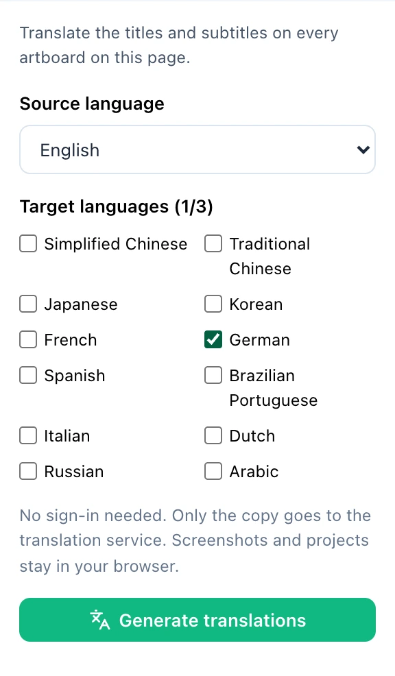
Live editor capture from November 21, 2026. A target language is selected; no translation request was submitted for this capture.
- Back up the source. Download the project JSON and keep the current exported images for comparison.
- Generate a translation. Open Translate in the left sidebar and select the source and target languages. Check brand names, feature names and the promise of each caption in the review.
- Choose Copy as language versions. Work on a separate page for each target language. Use Overwrite current page when replacing that page is intentional.
- Review every headline and subtitle. Fix awkward or verbose wording, try phrase breaks, adjust spacing, and then compare type sizes.
- Replace the app captures where needed. Caption translation does not rewrite buttons, menus or amounts inside an uploaded image. If your app supports the target language, switch the app to that language and capture the same feature state.
- Export and inspect each language page. Organize the files by locale and device before uploading to the matching store slots.
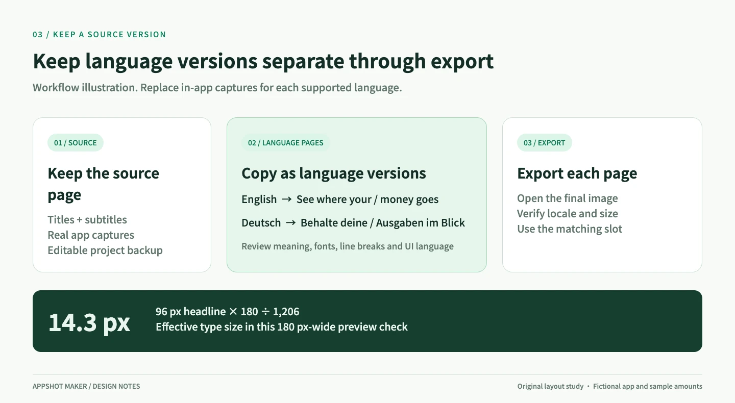
Figure 3. You can organize the downloaded files into folders such as en-US/iphone/01.png. Folder names do not select the upload language inside a store console.
Online translation sends the titles and subtitles to a translation service; screenshots and projects stay in the browser. Also confirm which languages the app itself supports, so the listing sets accurate expectations. Apple and Google Play provide separate workflows for localized store information and assets. Apple localization help · Google Play localization help
Check the downloaded image at two sizes
Inspect the original pixels for missing glyphs, clipping and UI details. Then reduce the image to a size close to a phone browsing experience and check whether the main benefit is still readable. Both views help catch errors that are easy to miss on a large editor canvas.
- Meaning: brand names and numbers are correct; the translation has not invented a feature.
- Headline boundaries: no missing ending, broken phrase or stray word on an unnecessary third line.
- Vertical spacing: the extra line leaves room for the subtitle, frame and important UI.
- Glyphs: accents and special characters display correctly, with consistent weight and size.
- App language: menus, dates, currencies and examples match the intended version.
- Output: dimensions, transparency, sequence and upload locale are checked in the downloaded files.
Repeat the layout review for each final device size. A wider tablet canvas changes the composition, even when every word technically fits. Check App Store screenshot sizes
Questions that come up during localization
Is there a safe character limit for every language?
No single character count guarantees a fit. Glyph width, font weight and word boundaries can all change the result. Set a text-area width, a preferred type size and the number of lines available, then check the actual copy.
Can I translate the caption and leave the app UI in the source language?
When the app supports the target language, use captures from that version, particularly when the selling point depends on a menu or on-screen explanation. If it does not, represent that limitation honestly and decide whether the market is ready to promote to.
Should I switch to a narrower font?
It is an option, provided the font has suitable licensing, covers the target script and remains readable at small sizes. Partial font fallback can also create uneven shapes and widths. Review the copy and line breaks before changing the typeface across a language set.
How much will this improve downloads?
This walkthrough did not measure downloads. The width measurements establish whether these examples fit. To evaluate conversion, use a store experiment with a defined change and decision rule, recording traffic, locale and release changes that could affect the result.
Start with the most crowded screenshot in your set. Once its wording, line breaks and UI language work together, apply the same review to the remaining artboards. Adjust your localized screenshots
Ready to design your store screenshots?
Try AppShotMaker and turn raw captures into store-ready screenshots in minutes.