
Table of contents
- Quick nav
How to Test Your First Three App Store Screenshots at Thumbnail Size
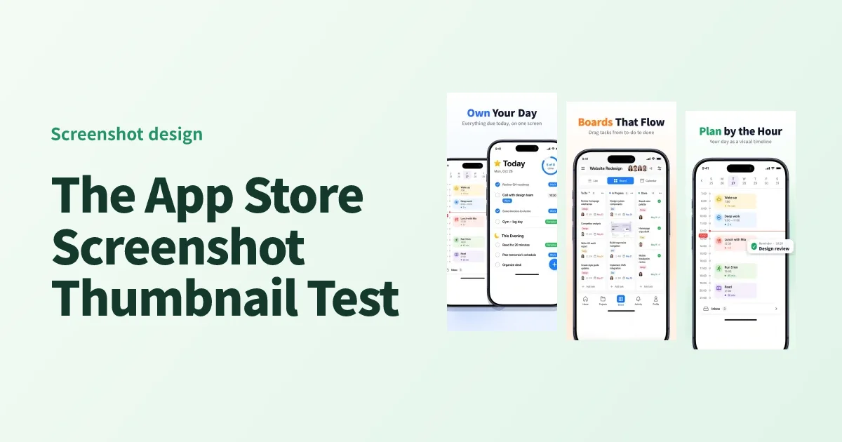
On a full-size design canvas, every detail seems visible. The settings labels are sharp, the phone frame looks good, and the caption fits on two lines. Shrink that same App Store screenshot to the width of a small preview and all a reader may see is a phone on a blue background.
Before you submit, look at the first three screenshots together at thumbnail size. Check whether someone can identify the app, point to the interface that backs up the headline, and tell you something different about each frame.
Run the thumbnail test
- Export the first three PNGs in their intended order. Use the store listing preview to see them together, or place the images in a row in your design tool.
- Start at about 120 px wide per image. Try 96 px as a second, stricter pass. These are practical test widths. The real layout varies with device, orientation, and App Store placement.
- Let someone unfamiliar with the app look for a few seconds. Then hide the images and ask what the app helps them do and which screenshot showed it. Ask them to point to one part of the actual UI when you reveal the images again.
Keep the files in the same order and at the same width when you compare revisions. This makes it easier to see whether the change you made improved readability.
A worked example for a meal-planning app
Say the current opening sequence reads “Plan smarter,” “Stay organized,” and “Make it yours.” Each headline fits, but they could describe a calendar, a notes app, or a budgeting tool. Three specific claims give people something to look for.
| Frame | Headline | What the screen needs to show |
|---|---|---|
| 01 | Plan a week of dinners | A filled week with recognizable meals in the calendar |
| 02 | Build a grocery list | Items grouped in a way that makes shopping easier |
| 03 | Cook with what you have | Ingredients already on hand next to a recipe that uses them |
The first frame establishes the main task. The second shows what happens after planning. The third gives someone a distinct reason to pick this app. If the app mainly helps people use up ingredients, move that idea to frame one and run the same test again.
Fix the part that failed
The message takes too long to read. Try cutting the headline to the action and its outcome. “Automatically create a personalized shopping list” becomes “Build a grocery list.” Check contrast on the actual background, especially behind the smallest text. If the first frame needs fewer words, use the supporting line to answer one specific question.
The headline is clear, but the screen is hard to recognize. Give the relevant interface more room. For the grocery list frame, show a few groups and enough of the surrounding UI to make it clear where they are. Use a real screen from the feature you describe. Apple’s screenshot guidance allows overlays that clarify the experience and asks that the screenshots show the app in use. Apple’s screenshot review guidance
All three frames make the same point. Read only the headlines, in order. If two describe planning meals, keep the stronger proof of that task and use the other frame for something a reader still needs to learn. Keep the alignment and type hierarchy consistent so the set still feels related.
Check the files at full size before upload
Go back to your production exports and inspect them at their real dimensions. Look for blurry UI, clipped captions, and genuine personal information in the sample account. Match the file to the display slot in App Store Connect. For example, Apple lists 1206 × 2622 and 1179 × 2556 as accepted portrait sizes for iPhone with Dynamic Island (medium display). Apple’s screenshot specifications
Start with a single revision such as a shorter headline, larger UI, or a different first frame. Export the set again from the screenshot editor and compare both passes side by side. For a ready-made layout, open the screenshot template library, then replace the demo images with your own app captures.
Ready to design your store screenshots?
Try AppShotMaker and turn raw captures into store-ready screenshots in minutes.