
Table of contents
- Quick nav
Improve ASO with Better App Store and Google Play Screenshots
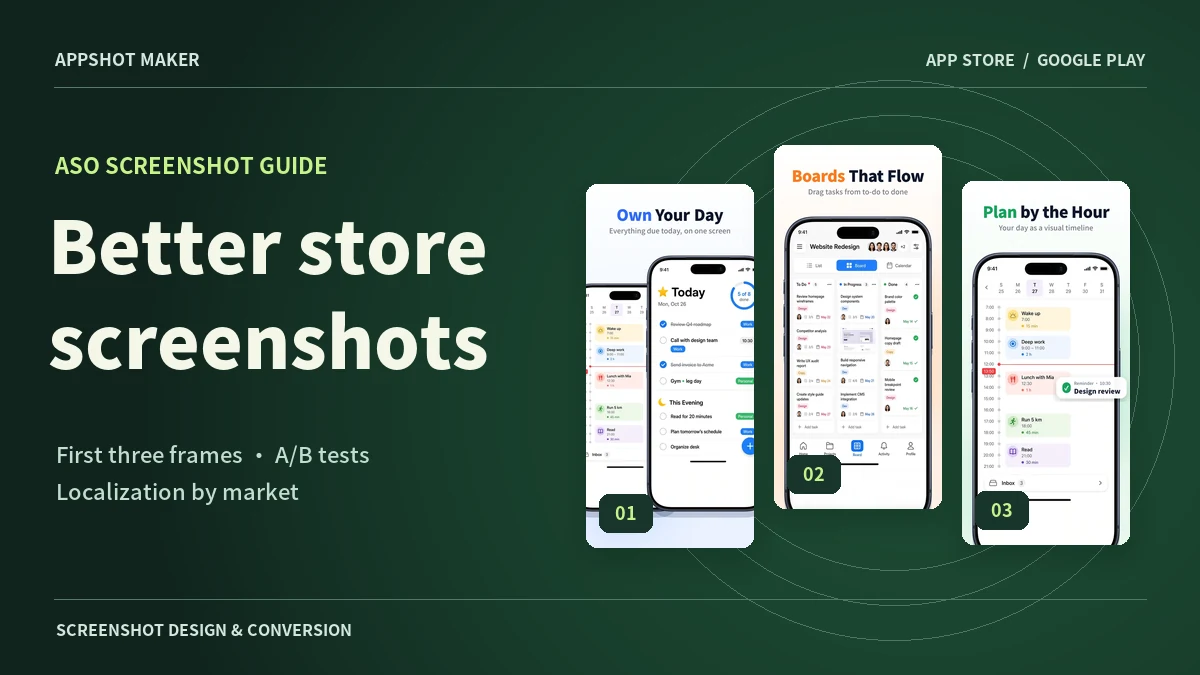
Your screenshots help someone decide whether your app is worth installing. Look at your first card at search-result size. If all you can make out is a nice phone frame, the reader still has to zoom, swipe, or read the description to figure out what your app does.
The impact is worth testing. In a case study published by SplitMetrics, OLBG reported a 61% increase in test conversion after iterating on its iOS screenshot design and order. That figure is a relative conversion improvement from one case. A live listing can see a different result depending on its audience and traffic. Compare versions within the same store and language to learn what works for your app. Original SplitMetrics case study
Make the first three screenshots work together
Apple says that when no app preview is available, the first one to three screenshots can appear in search results, depending on their orientation. Make the first card understandable on its own. Use cards two and three to demonstrate how the app works and what the user gets out of it. Apple’s product page guidance
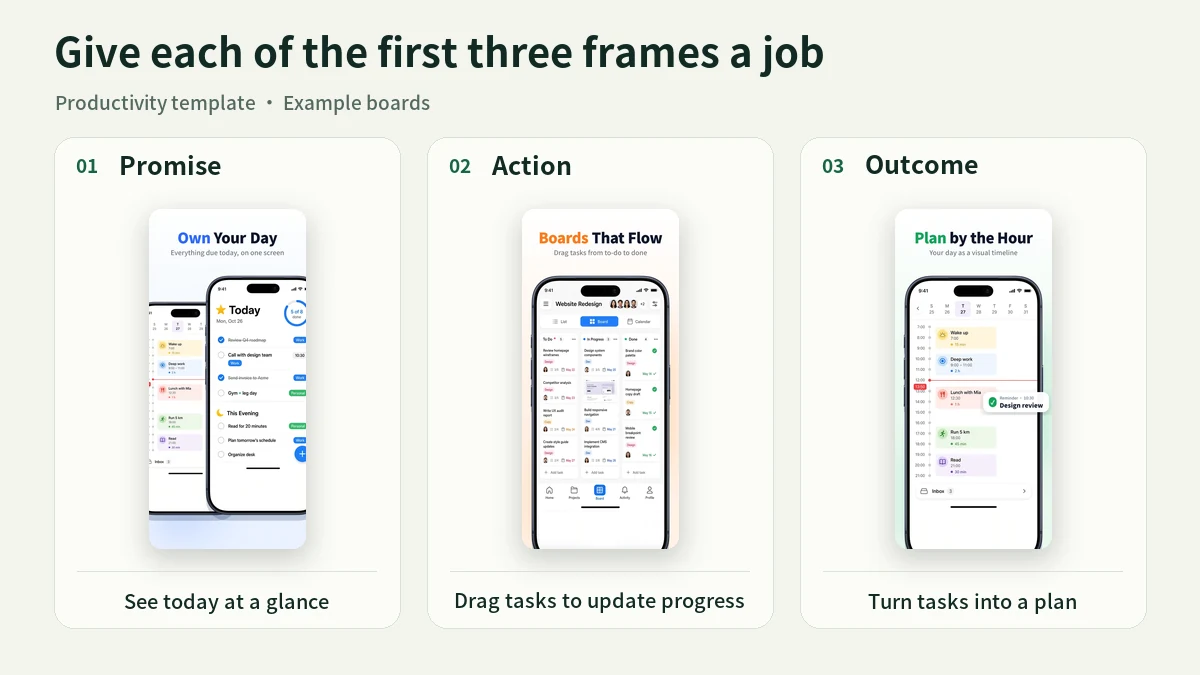
| Slot | Question it answers | Example for a task planner |
|---|---|---|
| 1. The promise | What can this app do for me? | “See today at a glance.” Show the actual task list a new user can open. |
| 2. The action | How would I use it? | “Drag tasks to update progress.” Show the board columns and movable cards. |
| 3. The outcome | What does a good session look like? | “Turn tasks into a plan.” Show a day with meetings, focus blocks, and breaks on a timeline. |
Try swapping the headline on two cards. If both still make sense, the cards probably tell the same story. Give one of them a different job. Then preview the set at phone size and check that the headline reads at a glance and the app screen visibly delivers on it.
Test one hypothesis and measure conversion
Start with the first card. Keep your live screenshots as A, then duplicate the set for B. A useful hypothesis is that an outcome-led headline will explain the app faster than a feature label. Change “Task management” to “See today at a glance,” keeping the app UI, colors, and image order identical. Run a later test for style, such as a device mockup versus a larger unframed view of the app.
| Store | Where to run the test | What to measure |
|---|---|---|
| App Store | Create a Product Page Optimization test in App Store Connect. Start with one localization and one treatment, and send the new screenshot assets for review. | Compare conversion, relative lift, and confidence in App Analytics. |
| Google Play | Create a Store Listing Experiment in Play Console. Choose the default graphics experiment or a localized experiment for the listing you want to test. | Choose the target metric in advance, such as unique user install clicks, then use it for every variant. |
Apple’s PPO setup guide · Apple’s test results documentation · Google’s Store Listing Experiments guide
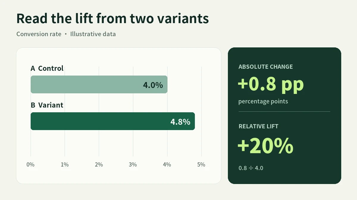
Suppose A converts at 4.0% and B at 4.8%. The gap is 0.8 percentage points, and dividing that gap by the 4.0% baseline gives a 20% relative lift. These are illustrative numbers. For a real decision, check the confidence or interval the platform reports and the minimum lift that would justify switching. If the result is inconclusive, preserve the baseline and choose a clearer hypothesis for the next round. Record the store, localization, dates, and asset version so you can trace what changed.
Localize the pitch for the market
A direct translation can preserve the words and still miss the use case. “See today at a glance” may work for English-speaking users who rely on a checklist. For a calendar-oriented audience, test “Make time for what matters” and open with the timeline instead. The app screen should support the promise made by the headline.
Keep one set of boards per language. Review line breaks and use actual app screens in the target language. Check date formats, currency, and units where they appear. Compare new and old assets within each market. Conversion differences between countries also reflect differences in traffic and audience, so they cannot isolate the effect of a translation.
Prepare your next variant in AppShot Maker
Pick a layout from the AppShot Maker template library, then replace the sample screens with captures from your app. Save your control, duplicate the page for the variant, and record the one element you plan to change. Select the target store size, check that headlines and UI still fit, then export individual PNG files or a ZIP with the full set. Upload the assets to App Store Connect or Play Console to run the experiment and collect the results.
If you can change only one card today, rewrite the first headline around a concrete result your app can show. Save it as B, keep the current version as A, and let the experiment decide which one stays. Open the screenshot editor
Ready to design your store screenshots?
Try AppShotMaker and turn raw captures into store-ready screenshots in minutes.